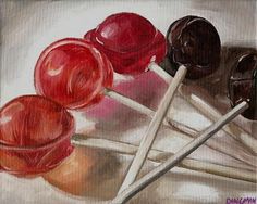
Colored Pencil Candy Still Life

Today’s essential question: What are some reasons that drawing from observation (or “real life”) is more difficult than drawing from a photograph?

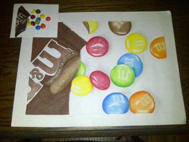
Today we will build a strong foundation for our candy still life project. We will practice drawing a piece of candy of our choice from multiple viewpoints, create a candy still life by arranging and hot gluing pieces of candy to a piece of foam core, photograph our still life, and post the photo of our still life to our blog.

Things you may want to consider when arranging your still life:

Wrapped vs. Unwrapped Candy
blow_pop_wrapped blow_pop_unwrapped hershey_s_kiss_by_enotsgnik-d72d8q3

The perspective/viewpoint
chocolate_side_view chocolate_birds_eye

Reference arrangement vs. drawing
reference_vs_drawing

Today we will:

  • In our sketchbooks, create 3 colored pencil drawings of the same piece of candy from different points of view. You may choose to unwrap the candy to make one of your viewpoints more interesting, but do not eat it, or you will have nothing to draw!
  • Create a candy still life by arranging 5-8 pieces of candy within the square piece of paper. Make sure you include at least 2 instances of overlap. You may wish to open wrappers to create visual interest.
  • Photograph our still life from multiple points of view.
  • Create a new blog post with the following:
    • a photograph of our candy still life.
    • photographs of our multiple viewpoints of candy sketchbook assignment (post as many photos as you need to show that you completed all 3 required drawings for this assignment).

Previewing what our designs will look like on an actual t-shirt

Today we will preview what our designs will look like on a t-shirt.

Here are some print-resolution t-shirt images to start with. You must use one of these images, both because our actual t-shirt color options are limited to black or white, and because they are large enough that they will print at a high resolution.

black_tshirt_women mens_black_tshirt

white_womens_tshirt white_mens_tshirt

Follow these steps to get your design on a t-shirt:

  1. Open your t-shirt design in Adobe Illustrator.
  2. Delete the layer with your original sketch.
    (Click on the layer with the sketch, then press the trash icon trash at the bottom of the layers palette.)
  3. Unlock all remaining layers.
    (Click on any lock icons lock in the layers palette. When the lock icon disappears, it means you have unlocked the layer.)
  4. Select the black arrow tool from the top of the toolbar. black_arrow
  5. Click and drag the arrow across the entire design area. This should select all the pieces of your design.
  6. Copy your design by pressing control + c.
  7. Download the t-shirt image of your choice from this post.
    (Click on the image to view it full size, then right click -> save image as and save it to your student number.)
  8. Open Adobe Photoshop.
  9. Open the t-shirt file you have downloaded from this post.
  10. Paste your design onto the t-shirt be pressing control + v. Several options will pop up. Select “paste as SmartObject.”
  11. Scale your design to the correct size by holding down shift AND scaling from the corner.
    (If you don’t do both of these things together, you may distort your design.)
    scaling_design
  12. When you are happy with your design, press the “enter” key.
    Here is an example of what a design might look like on a t-shirt:
    run_therapy_tshirt
  13. Save your design as both a photoshop file and a jpg.
  14. Upload the following two files to your blog:
    1. a PDF of your final t-shirt design (this is what we will print on the t-shirt)
    2. a jpg of your design on a t-shirt

Today we will:

  1. create a mock up of what our designs might actually look like on a t-shirt in Adobe Photoshop
  2. finish vectorizing our t-shirt designs in Adobe Illustrator
  3. create one blog post with
    1. a PDF of your final t-shirt design (this is what we will print on the t-shirt)
    2. a jpg of your design on a t-shirt
  4. If you have not already done so, write and post a 200-word thank you note to Donors Choose. Guidelines on what to include are in this blog post.

Creating our Vector T-shirt designs in Illustrator

Today we will begin tracing over our t-shirt design sketches in Adobe Illustrator.
We will view a demo at the Smart Board and then follow these steps:

  1. Open Adobe Illustrator.
  2. Select “New Print Document” from the pop up screen.
  3. Create a new file in Adobe Illustrator with the following guidelines:
    tshirt_setup_screen_shot
  4. Place the photo you took last class the file you just created. (File -> place)
    DO NOT try to open your downloaded image in Illustrator! This will cause strange things to happen.
  5. Create a new layer by clicking on the “new layer” button at the bottom of the layers palette on the right side of the screen. new_layer_button
  6. Select the pen tool. pen_tool
    Trace over your first shape. (You may need to decrease the opacity of this layer so you can see what you are tracing. You can do this by clicking on the transparency icon transparency_icon on the right side of the screen and decreasing the opacity so it is below 100. transparency_window)
  7. Bring the opacity back 100% and adjust the color if necessary.
  8. Repeat steps 3 and 4 until you are happy with your vector illustration.
  9. Save your Illustrator file, and then save a version as a .pdf
  10. Create a new blog post with the PDF of your progress. I do not expect you to finish your design, but I do expect you to post what you worked on today.

Advanced Illustrator: Compound Paths and Shape Tools

At Victoria’s request, here are some examples of designs made only of words:

love-endures   join the movement   indian-summer   continue-to-wonder-cropped   Love-The-Process   do-what-makes-you-come-alive-cropped   all_city_graffiti   negative-space   stick_to_it   dont_die_dreams_inside

Do NOT do this:
basketball_bad_typography

What is a Compound Path?

If your design has a strong balance of positive and negative space, there is a chance you will need to put a “hole” in the design so you can see the background. You can do this in Illustrator by creating a compound path.

Why should you create a compound path instead of just drawing a shape that is the same color as your background? Well, sometimes you need the negative space to be transparent (window decals, images in the background, etc).
coffee_shop

How to Create a Compound Path in Illustrator

  1. Right click to save this image to your desktop. DO NOT OPEN THIS IMAGE IN ILLUSTRATOR.
    rabbit_logo
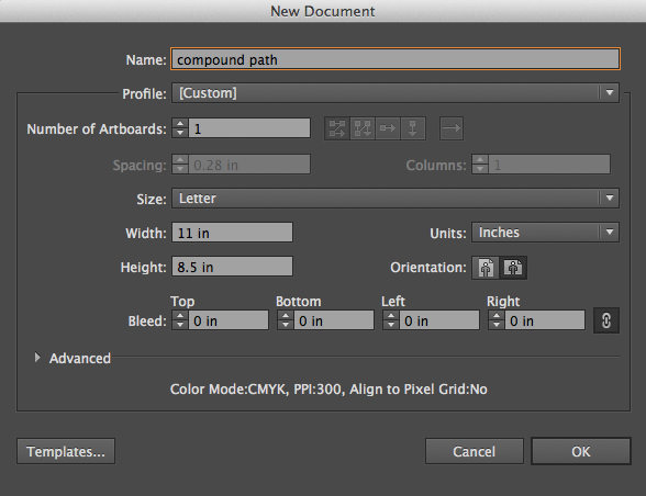
  2. Open Adobe Illustrator and create a new file. File -> New. Set up the dimensions as follows:
    new_file
  3. Place the image in Illustrator. File -> Place.
  4. Double-click the layer to and rename it “reference photo.”
    Click the box next to the eye to lock the layer (a lock icon should appear).
    layers_1
  5. Click the new layer button. new_layer Double-click on the new layer and name it “positive space.”
    layers_2
  6. Select the pen tool. pen_tool
  7. In the colors palette at the bottom left of the screen, remove the outline by clicking the outline icon to bring it forward, then clicking the square with the red line through it.
    no_stroke
  8. Double-click on the fill icon (the solid square) to change the fill color to something you like.
  9. Use the pen tool to outline the shape. Open the transparency window. (Window -> Transparency)
  10. Select the black arrow from the tool bar on the left side of the screen. black_arrow
    Then click anywhere on the screen away from the shape you have just traced to deselect it.
    pathed_positive_space
  11. Pick a different fill color.
  12. Make a new layer. Name it “negative space”.
  13. Select the pen tool and trace over the negative space shapes.
  14. Select the black arrow from the tool bar on the left side of the screen.
    Click on one shape at a time and make sure the opacity of each shape it set to 100%.
    pathed_negative_space
  15. Select all of the shapes by holding down on the shift key as you click each one.
    At the top of the screen, Object -> Compound Path -> Make.
  16. Your “negative space” shapes should now be completely transparent.
    transparent_rabbit
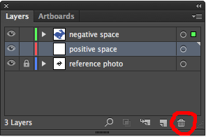
  17. Your “positive space” layer is now empty.
    Click on it and then click on the trash can icon to delete it.
    layers_3
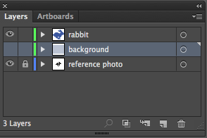
  18. Double-click on the “negative space” layer and rename it “rabbit”.
    layers_4

How to add a background:

  1. Make a new layer above your reference photo layer and below your positive space layer.
    Name it “background.”
    layers_5
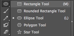
  2. Click the rectangle tool in the tool bar on the left side of the screen.
    rectangle_tool
  3. Change the fill color to be your desired background color.
  4. Click and drag to draw a box that covers the entire background area.
    blue_bg
  5. Save your file as a PDF (File -> Save as -> Select “Adobe PDF” as the file format)
    save_as_pdf
  6. Create a new blog post and upload the PDF.

Today we will:

  • complete the compound path/adding a background tutorial, save our file as a PDF, and post the PDF to our blog
  • begin sketching our t-shirt design

New Project: Vector T-shirt Design

For our next project, we will create a vector t-shirt design in Adobe Illustrator. You will have the opportunity to purchase a t-shirt with your design. White t-shirts are $10, and black t-shirts are $15. Here are some examples created by students last year:

Alyssa, Grade 10

Alyssa, Grade 10

Francheska, Grade 9

Francheska, Grade 9

Jason, Grade 9

Jason, Grade 9

Ler Tha, Grade 10

Ler Tha, Grade 10

Lily, Grade 9

Lily, Grade 9

Taylor, Grade 9

Taylor, Grade 9

Today we will learn how to use the pen tool in Adobe Illustrator. This is the tool and software program that we will use in our t-shirt design.

Pen Tool for Beginners: Vector Practice Tutorial

  1. Download the “vectorpractice.zip” file here.
  2. Go to your Downloads folder, locate the zip file, drag it to your Desktop, and double-click the file to unzip it.
  3. Open the .ai file in Illustrator.
  4. Trace over each shape with the pen tool. (They are numbered from the simplest to the most complex.)
  5. Save your file as a PDF. (File -> Save as -> PDF).
    Remember where you saved your file! If you don’t know where you saved your file, the teacher certainly won’t.
  6. Create a new blog post. Upload the PDF containing the vector images you have traced and describe any difficulties you had with the pen tool.
  7. Create a second blog post with your Donors Choose thank you note. (If you have not done so already!)

Editing in Photoshop: Cropping & Levels

Today we will learn some basic photo editing techniques. You may experiment with editing your photos AFTER you have finished your skeleton drawing and published a Donors Choose thank you note to your blog.

First, here are some of my favorite photos from last class:

playground

Photo Credit: Ms. Lawson

taylor-playground-trip-007

Photo Credit: Taylor

Photo Credit: Katelyn

Photo Credit: Katelyn

Photo Credit: Rickie

Photo Credit: Rickie

Photo Credit: Kiera

Photo Credit: Kiera

Straightening a crooked image

In general, try to hold your camera straight, and when possible, steady it by leaning it on a sturdy surface.
If you have accidentally taken a crooked photo however, you can straighten it in Photoshop. Here is an example: Photo credit: Betty

How to Straighten a Crooked Image in Photoshop

  1. In your layers palette on the lower right side of the screen, double click the background layer. Rename it.
  2. View -> Rulers view_rulers
  3. Rulers will show up on the top and left side of the screen. Click anywhere in the ruler area and drag toward the photo to create a guide. guide_Adding_instructions
  4. Adjust the guide so it is next to an object with a straight edge that is currently slanted. You will use this guide as your reference. (In the example below, I have added a vertical guide to compare to the street light, and a horizontal guide to compare to the horizon line.) Screen Shot 2015-05-06 at 3.26.01 PM
  5. Edit -> Transform -> Rotate
  6. Rotate the image until the edge of your object is parallel to your guide. Then press the “enter” key. Screen Shot 2015-05-06 at 3.26.48 PM
  7. Select the crop tool from the tools palette on the left side of the screen. crop_tool
  8. Drag your crop tool to select the area you want to keep. Press the “enter” key once you have successfully evened out the edges of your image. Screen Shot 2015-05-06 at 3.27.11 PM

Cropping to Create a Stronger Focal Point (or Remove Distracting Objects)

You can also use the crop tool to cut out distracting objects in the background and make the focal point stand out more.
I cropped a photo taken by Ralph to focus the viewer’s eye more on Azari.

ralph-img_0079   ralph-img_0079_bw_cropped

Important Note #1: Whenever you edit an image, save a version of the image with a new name by going to the top of the screen and selecting File -> Save As, and naming it something that makes sense. For example, if the original image was named “Flower123,” and you cropped the image, name the edited version “Flower123_cropped.”

Important Note #2: Not every image needs to be cropped! If an image looks great already, leave it alone.

How to Increase Contrast by Adjusting Levels

  1. Image -> Adjustments -> Levels
  2. Look at the image that pops up. If your image has sufficient contrast, the “mountain range” will extend to the edge of the window. If your image looks similar to this, you do not need to adjust the levels, and can close out of the window: levels_no_adjustment

    If your “mountain range” of values does not extend to the edges of the window (such as the example below), you will click on the left cursor and drag it to the beginning of the left side of the mountain. You will then click on the right cursor and drag it to the beginning of the right side of the mountain. You will be able to preview what you are doing as long as the “preview” box is checked. levels_before_and_after When you have adjusted your levels, click ok.

Today we will:

  • Finish our skeleton drawings
  • Finish our Donors Choose Thank You Notes
  • Experiment with editing some of the photos we have taken this marking period.
  • Create a new blog post with before and after images of any photos we edited today. Michele’s blog post has a great example of how to show before and after images side by side.

Photography Day 2: Camera Angle

Here are some of my favorite student photos from last class. How do they showcase the elements of art?

Photo Credit: Kiera, Grade 10

Photo Credit: Kiera, Grade 10

Photo Credit: Raphael, Grade 10

Photo Credit: Raphael, Grade 10

Photo Credit: Mckenzie, Grade 10

Photo Credit: Mckenzie, Grade 10

Photo Credit: Jason, Grade 10

Photo Credit: Jason, Grade 10

Today’s essential question: How can pointing a camera up, down, or straight ahead change the overall mood of the photograph?

Today we will focus on taking interesting photographs from different camera angles.

Angle of View

Eye Level An eye level angle is the one in which the camera is placed at the subject’s height. Eyelevel shots are incredibly common because they are neutral. They often have no dramatic power whatsoever. cat_eye_level   eye-level-great-white_shark

High Angle In a high angle (bird’s eye view), the camera is above the subject, looking down. High angle shots can make the subject seem vulnerable or powerless, and are usually used to make the image more dramatic. high angle view of a young man dunking a basketball   high_angle_dog

Low Angle Low angles (worm’s eye view) are captured from a camera placed below the subject, looking up at them. Low angles make the subject look dominant, aggressive, or ominous. dave-hill-dynamic-angles   ??????????????????????????????????????????????????????????????????????

Today we will:

  • take photos outside, focusing on different camera angles (birds eye view, worm’s eye view, eye level view)
  • create a new blog post with the bet photos we took today

Photographing Line & Shape

Today’s essential question: How can I use the elements of art to create interesting photographs?

Today we will take photos, trying to capture line and shape in interesting ways. You must post your best photos from today to your blog in order to receive participation points for the day.

Line

line-476935 line-Leading-Line line-High-Speed-Rail-Tokyo-500x330 line-End-of-the-lineVCTFH0001

Shape

shape-creating-heart-shape-on-a-book-with-a-ring-photography-trick shape-geometric7-1-of-1 shape-grapes-multi-color

Donors Choose Thank You Letter

portfolio_oil_pastelsThe water-soluble oil pastels we used were funded by an organization called Donors Choose. Once you finish your skeleton drawing, please write a 200-250 word thank you note to the donors and post it to your blog. If you’d like, you can also take a photo of your finished oil pastel drawing and post that to your blog as well. I will then print and mail the thank you notes to the donors, along with some photos of our class in action and the finished projects. If you would like to be in a photo for the Donors Choose thank you package, please let Ms. Lawson know.

If you are not sure what to write, here are some questions that will get you started:

  • What did we get? (Each student got a 24 pack of water-soluble oil pastels and the class got some paintbrushes to blend the oil pastels)
  • How did we use the oil pastels?
  • What was special about these oil pastels?
  • What did we learn?
  • How did their donation make a difference to our art class?
  • Begin the letter with “Dear Donors” and sign it with your first name only