T-Shirt Day 3: Previewing what our designs will look like on an actual t-shirt

Today’s essential question: How can I use Photoshop to preview how my design will look on an actual t-shirt?

Today we will preview what our designs will look like on a t-shirt.

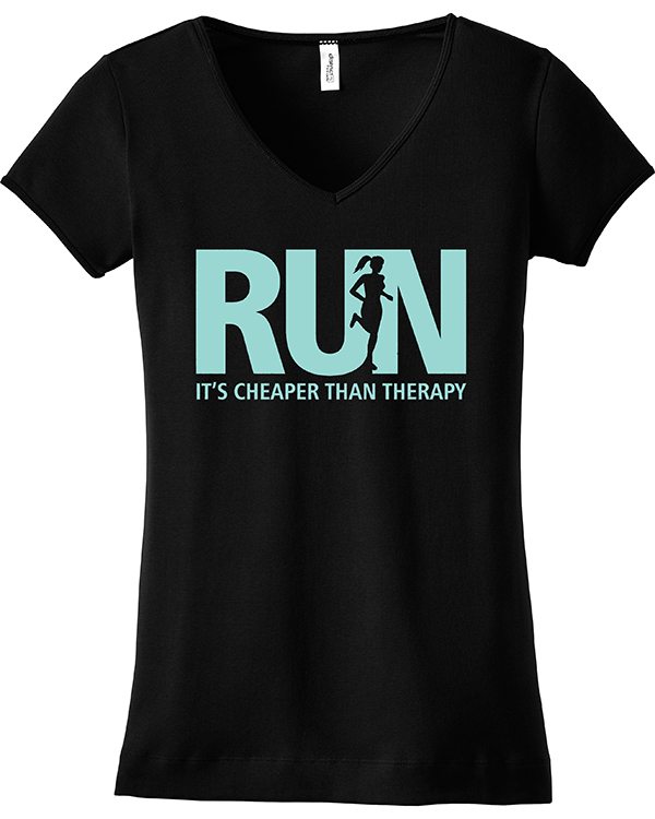
Here are some print-resolution t-shirt images to start with. You must use one of these images, both because our actual t-shirt color options are limited to black or white, and because they are large enough that they will print at a high resolution.

black_tshirt_women mens_black_tshirt

white_womens_tshirt white_mens_tshirt

Follow these steps to get your design on a t-shirt:

Part 1: Adobe Illustrator

  1. Open your t-shirt design in Adobe Illustrator. 
  2. Delete the layer with your original sketch.
    (Click on the layer with the sketch, then press the trash icon trash at the bottom of the layers palette.)
  3. Unlock all remaining layers.
    (Click on any lock icons lock in the layers palette. When the lock icon disappears, it means you have unlocked the layer.)
  4. Select the black arrow tool from the top of the toolbar. black_arrow
  5. Click and drag the arrow across the entire design area. This should select all the pieces of your design.
  6. Copy your design. (Edit -> Copy)
  7. Download the t-shirt image of your choice from this post.
    (Click on the image to view it full size, then right click -> Save Image As and save it to your Desktop.)

Part 2: Adobe Photoshop

  1. Open Adobe Photoshop. 
  2. Open the t-shirt file you have downloaded from this post. (File -> Open. It should be on your Desktop if you saved it according to the instructions.)
  3. Paste your design onto the t-shirt. (Edit -> Paste) Several options will pop up. Select “paste as SmartObject.”
  4. Scale your design to the correct size by holding down shift AND scaling from the corner.
    (If you don’t do both of these things together, you may distort your design.)
    scaling_design
  5. When you are happy with your design, press the “enter” key.
    Here is an example of what a design might look like on a t-shirt:
    run_therapy_tshirt
  6. Save your design as both a Photoshop file (.PSD) and a PNG.
  7. Create a final blog post with the following:
    1. a PDF of your final t-shirt design (this is what we will print on the t-shirt)
    2. a PNG of your design on a t-shirt
    3. a 150 word artist statement about your t-shirt design. Not sure what to write? Start by answering the following questions:
      • Describe your artwork
        • What does your artwork look like? What is the subject matter?
        • What art elements or principles are most obvious in your work? (ex. color, line, shape, space…)
      • How did you create your art?
        • What media is your artwork made from?
        • Describe the process or steps you took to create your artwork.
      • What is the big idea behind your artwork?
        • Who or what inspired your t-shirt design?
        • Who is the target audience for your design? (Who do you think would buy your t-shirt? What stores would sell it? Why do you think your t-shirt would be successful with this group of people?)
      • Overall thoughts
        • What did you learn from creating your t-shirt design?
        • Is the final piece what you imagined? How so?
        • What did you do well? What could you have done better?

Today we will:

  1. Finish vectorizing our t-shirt designs in Adobe Illustrator
  2. Create a mock up of what our designs might actually look like on a t-shirt in Adobe Photoshop
  3. Create one blog post with the following
    1. a PDF of your final t-shirt design (this is what we will print on the t-shirt)
    2. a PNG of your design on a t-shirt
    3. an artist statement about your t-shirt design

T-shirts Day 2: Creating our Vector T-shirt designs in Illustrator

Today’s essential question: How can I use Adobe Illustrator to turn my t-shirt design sketch into a vector graphic?

Today we will begin tracing over our t-shirt design sketches in Adobe Illustrator.
We will view a demo at the Smart Board and then follow the steps below.

Note: Make sure you have taken a photo from straight on. For best results, tape the photo to the wall at eye level. If your photo is angled, like the one below, you will need to retake it:
angled_photo

Here is an example of a photo taken from the correct angle:
photo_straight_on

Part 1: Setting Up Our Files in Adobe Illustrator

  1. Open Adobe Illustrator.
  2. Select “New Print Document” from the pop up screen.
  3. Create a new file in Adobe Illustrator with the following guidelines:
    tshirt_setup_screen_shot
  4. Place the photo you took last class the file you just created. (File -> place)
    DO NOT try to open your downloaded image in Illustrator! This will cause strange things to happen.

Part 2: Tracing Over Our Sketch with the Pen Tool

  1. Create a new layer by clicking on the “new layer” button at the bottom of the layers palette on the right side of the screen. new_layer_button
  2. Select the pen tool. pen_tool
    Trace over your first shape. (You may need to decrease the opacity of this layer so you can see what you are tracing. You can do this by clicking on the transparency icon transparency_icon on the right side of the screen and decreasing the opacity so it is below 100. transparency_window)
  3. Bring the opacity back 100% and adjust the color if necessary.
  4. Repeat steps 3 and 4 until you are happy with your vector illustration.

Special Tool: The Shape Tool

  1. You may wish to use the shape tool to easily draw squares, rectangles, and circles. It is located in the toolbar on the left side of the screen. Click and hold the rectangle to bring up other shape options:

Part 3: Saving Our File

  1. Save your file as BOTH a .pdf and PNG
    1. To save as a PDF (File -> Save As – PDF)
    2. To save as a PNG (File -> Save for Web and Devices -> PNG-24)
  2. Create a new blog post with BOTH the PDF and PNG of your progress. I do not expect you to finish your design, but I do expect you to post what you worked on today.

Today we will:

  • Create a new 12×12″ file in Illustrator and place our t-shirt sketch in this file.
  • Begin tracing over our t-shirt design sketches in Adobe Illustrator with the pen tool.
  • Upload our PDF, PNG, and photo of our sketch to our shared Foundations 2 Google Drive Folder
  • Create a new blog post with both a PDF and PNG of our progress so far.

Google Digital Skills Lesson

google-doodle-866x487.jpg

Over the next two classes, we will work on a Google Digital Skills lesson. This will qualify us for a Donors Choose gift card that we will be able to apply towards another iPad.

Today we will:

  1. Go to g.co/applieddigitalskills
  2. Click “Sign In,” and sign in with your school Google account
  3. Select “I am a student”
  4. Enter class code 2YS36S
  5. Watch the introductory video on their dashboard (if this is their first time using Applied Digital Skills)
  6. Click into the first lessons of the class on their dashboard
  7. Put on headphones and watch the first video

New Project: Vector T-shirt Design

Today’s essential question: How can I use the pen tool to create an attractive vector t-shirt design in Adobe Illustrator?

For our next project, we will create a vector t-shirt design in Adobe Illustrator. You will have the opportunity to purchase a t-shirt with your design. White t-shirts are $10 and black t-shirts are $15. Money for the t-shirts is due no later than Thursday, October 25.

Today we will sketch our t-shirt design on a piece of paper. We will then use Sharpies to color our design with solid areas of color. You can use as many colors as you think your design needs, but you cannot shade or blend any colors. You will then post a photo of your colored sketch to your class blog. You must post a photo of your sketch to receive participation points for today, even if you have not finished your design. Next class, we will begin vectorizing our design in Adobe Illustrator.

T-Shirt Design Project Requirements:

  • Your original concept. No copyrighted characters.
  • Balance of positive and negative space
  • Variety of line weight
  • Sketch colored in Sharpie (solid color with no shading), then vectorized in Illustrator
  • Design does not run off edges of paper
  • No copyrighted characters

Here are some examples created by students in past years:


Today we will:

  • Sketch our t-shirt design on a piece of paper
  • Color in our t-shirt design with Sharpie
  • Tape our t-shirt design to a wall, and take a photo of the design
  • Post the photo of our t-shirt design to our class blog

Advanced Illustrator: Compound Paths and Shape Tools

Today’s essential question: How can I make a compound path in Adobe Illustrator? 

Today we will complete a tutorial that will teach us to do the following things in Adobe Illustrator: create a compound path, use the built in shape tools, and create a solid color background. We will post both a PDF and a PNG of the completed tutorial to our blogs.

We will then finish any incomplete assignments and post those to our blog (vector shapes practice, final photo reflection, etc.)

What is a Compound Path?

If your design has a strong balance of positive and negative space, there is a chance you will need to put a “hole” in the design so you can see the background. You can do this in Illustrator by creating a compound path.

Why should you create a compound path instead of just drawing a shape that is the same color as your background? Well, sometimes you need the negative space to be transparent (window decals, images in the background, etc).
coffee_shop

How to Create a Compound Path in Illustrator

  1. Right click to save this image to your desktop. DO NOT OPEN THIS IMAGE IN ILLUSTRATOR.
    rabbit_logo
  2. Open Adobe Illustrator and create a new file. File -> New. Set up the dimensions as follows:
    new_file
  3. Place the image in Illustrator. File -> Place.
  4. Double-click the layer to and rename it “reference photo.”
    Click the box next to the eye to lock the layer (a lock icon should appear).
    layers_1
  5. Click the new layer button. new_layer Double-click on the new layer and name it “positive space.”
    layers_2
  6. Select the pen tool. pen_tool
  7. In the colors palette at the bottom left of the screen, remove the outline by clicking the outline icon to bring it forward, then clicking the square with the red line through it.
    no_stroke
  8. Double-click on the fill icon (the solid square) to change the fill color to something you like.
  9. Use the pen tool to outline the shape. Open the transparency window. (Window -> Transparency)
  10. Select the black arrow from the tool bar on the left side of the screen. black_arrow
    Then click anywhere on the screen away from the shape you have just traced to deselect it.
    pathed_positive_space
  11. Pick a different fill color.
  12. Make a new layer. Name it “negative space”.
  13. Select the pen tool and trace over the negative space shapes.
  14. Select the black arrow from the tool bar on the left side of the screen.
    Click on one shape at a time and make sure the opacity of each shape it set to 100%.
    pathed_negative_space
  15. Select all of the shapes by holding down on the shift key as you click each one.
    At the top of the screen, Object -> Compound Path -> Make.
  16. Your “negative space” shapes should now be completely transparent.
    transparent_rabbit
  17. Your “positive space” layer is now empty.
    Click on it and then click on the trash can icon to delete it.
    layers_3
  18. Double-click on the “negative space” layer and rename it “rabbit”.
    layers_4

How to add a background:

  1. Make a new layer above your reference photo layer and below your positive space layer.
    Name it “background.”
    layers_5
  2. Click the rectangle tool in the tool bar on the left side of the screen.
    rectangle_tool
  3. Change the fill color to be your desired background color.
  4. Click and drag to draw a box that covers the entire background area.
    blue_bg
  5. Save your file as a PDF (File -> Save as -> Select “Adobe PDF” as the file format)
    save_as_pdf
  6. Save your file as a PNG. (File -> Save for Web and Devices -> PNG-24)
  7. Create a new blog post and upload both the PDF and PNG.

The following people need to finish and post their completed Final Photography Blog Post (10 best edited photos + 150 word Artist Statement):

  • Jaz’Monya
  • Lorelei
  • Italia
  • Loral
  • Sydney
  • Sidney
  • Norah
  • Taliyah
  • Miriam
  • Tommy
  • James
  • Holly
  • Tyrelle
  • Quinten (turn artist statement into paragraph form)

The following people need to finish and post their completed Vector Practice PDF to their blogs:

  • Jaz’Monya
  • Norah
  • Taliyah (need to finish)
  • Miriam
  • Andrea

Today we will:

  • Complete the compound path/adding a background tutorial, save our file as a PDF, and post the PDF to our blog
  • Complete and post any missing assignments to our blog (vector shapes, final photo reflection, etc)

Basic Photo Editing & Final Reflection

Today’s essential questions: How can editing an image improve a photo? When should I not edit an image?

Today we will learn some techniques for editing photos, and then create a blog post with the ten best (edited) photos taken during our photography unit and a 150-word reflection on the unit. Keep in mind that not all photos need editing. If a photo looks great, leave it alone!

Final Photography Blog Post Project Requirements:

  • The 10 best (edited) photos we have taken during the photo unit
  • A 150-word reflection (in paragraph form) on our fall photography unit. Not sure what to write? Start by answering these questions:
    • What are some ways your photography has improved over the course of this unit?
    • What advice would you give someone who is just starting out in photography?
    • What are some things you still struggle with when taking photos?
    • If you had one more day to take photos, what type of photos would you take?
    • How do you like photography compared to other media (drawing, painting, computer art, clay, etc.)? Do you find it easier or more difficult? Why?

Basic Photo Editing in Photoshop

Straightening a crooked image

In general, try to hold your camera straight, and when possible, steady it by leaning it on a sturdy surface. If you have accidentally taken a crooked photo however, you can straighten it in Photoshop. Here are some examples:

Photo credit: Betty

Photo credit: Lizzy

How to Straighten a Crooked Image in Photoshop

  1. In your layers palette on the lower right side of the screen, double click the background layer. Rename it.
  2. View -> Rulers
    view_rulers
  3. Rulers will show up on the top and left side of the screen.
    Click anywhere in the ruler area and drag toward the photo to create a guide.
    guide_Adding_instructions
  4. Adjust the guide so it is next to an object with a straight edge that is currently slanted. You will use this guide as your reference. (In the example below, I have added a vertical guide to compare to the street light, and a horizontal guide to compare to the horizon line.)
    Screen Shot 2015-05-06 at 3.26.01 PM
  5. Edit -> Transform -> Rotate
  6. Rotate the image until the edge of your object is parallel to your guide.
    Then press the “enter” key.
    Screen Shot 2015-05-06 at 3.26.48 PM
  7. Select the crop tool from the tools palette on the left side of the screen. crop_tool
  8. Drag your crop tool to select the area you want to keep.
    Press the “enter” key once you have successfully evened out the edges of your image.
    Screen Shot 2015-05-06 at 3.27.11 PM

Cropping Distracting Objects Out of an Image

You can also use the crop tool to cut out distracting objects in the background and make the focal point stand out more. Notice how much stronger the image on the right is, because I have focused the attention on Robert by cropping out the distracting elements around him:
IMG_2444_bw IMG_2444edited

Important Note #1: Whenever you edit an image, save a version of the image with a new name by going to the top of the screen and selecting File -> Save As, and naming it something that makes sense. For example, if the original image was named “Flower123,” and you cropped the image, name the edited version “Flower123_cropped.”

Important Note #2: Not every image needs to be cropped! If an image looks great already, leave it alone.

How to Increase Contrast by Adjusting Levels

Important Note: If your photo already has sufficient contrast, you do not need to further adjust levels. Doing so will cause parts of your photo to become over- or under-exposed.

  1. Image -> Adjustments -> Levels
  2. Look at the image that pops up. If your image has sufficient contrast, the “mountain range” will extend to the edge of the window.
    If your image looks similar to this, you do not need to adjust the levels, and can close out of the window:

    levels_no_adjustment

    If your “mountain range” of values does not extend to the edges of the window (such as the example below), you will click on the left cursor and drag it to the beginning of the left side of the mountain.
    You will then click on the right cursor and drag it to the beginning of the right side of the mountain.
    You will be able to preview what you are doing as long as the “preview” box is checked.

    levels_before_and_after

    When you have adjusted your levels, click ok.

Today we will:

  • Learn some basic photo editing techniques in Photoshop
  • Gather and edit the best 10 photos taken during our fall photography unit. Not sure which photos are the best? Ask your classmates and Ms. Lawson for feedback.
  • Create a final blog post with:
    • the 10 best (edited) photos we have taken during the photo unit
    • a 150-word reflection on our fall photography unit

Photo Assignment #7: Candid Portraiture

Today’s essential question: How can I take great candid photos of people?

Candid portraits, or portraits that are taken “in the moment,” rather than staged, are often the key to taking flattering photos of people. Here are some tips that will help you take great candid photos:

1. Take your camera everywhere. Probably the best way to take spontaneous photographs is to always be ready to do so. Taking your camera with you everywhere also helps people to be more at ease with you taking their photo. Once friends and family expect you to have my camera out, they will act more relaxed if they do catch you taking a photo, making the photos appear more natural.

darren_josh_large.png

2. Position yourself strategically. Anticipate what is about to unfold in front of you to increase the chances of getting some great shots. Which way will people be facing? What will they be doing? What will the light be like? Thinking through these issues will save you having to run around repositioning yourself when you should be shooting images – it’ll also mean you take a whole heap less shots of the back of people’s heads!

alyssa0751

3. Zoom in. The further you are away from your subject the less likely they will be to know that you’re photographing them, and the more natural and relaxed they’ll act. Using zoom enables you to shoot from outside their personal space but keep the feeling of intimacy in the shot you’re taking. One of my students pretended to be upset with her fellow classmates. They then gave her enough space that she was able to take better candid photos without them noticing!

Note: This tip only works if you are using an actual camera, not a camera on your phone. Most phone cameras don’t have a true zoom; rather, their digital zoom feature merely crops your photo. Avoid zooming on a phone camera to prevent blurry images.

Photo Credit: Mariana, 10th Grade

4. Shoot first, compose later. And shoot lots. Don’t worry about framing the perfect shot while the camera is in your hand. Keep moving, getting as many angles and moods as possible. Click fast and often. Back at the computer, you can refine your raw material into a beautifully composed candid. Purists like Henri Cartier-Bresson shunned cropping as a kind of photographic half-truth; for the rest of us, there’s Photoshop. When you shoot multiple images quickly of a person, you’ll increase your chances of that perfect shot. This is especially helpful if your subject moves quickly or is a talker.

yolpicnelsiesmiling1

5. Don’t pose subjects. People look relaxed and comfortable when they’re engaged in activity – talking with one another, fixing their hair, petting the dog. Anything that keeps their mind off your lens is good. Wait until your subject is has forgotten that you are photographing them and is fully focused upon what they are doing or who they are with.

6. Photograph people with people. Something very interesting happens when you photograph more than one person in an image at a time – it introduces relationship into the shot. Even if the two (or more) people are not really interacting in the shot it can add depth and a sense of story into the viewing of the image.

IMG_1356_bw

7. Frame images with foreground elements. Purposely include something in the foreground of the shot to make it look as though you’re hiding behind it. You might do this with by shooting over someone’s shoulder, by including a little of a tree branch or the frame of a doorway.

Photo Credit: Bayleigh, 11th Grade

8. Be patient and catch people in the moment. Waiting is an important part of getting a good photo; wait for that perfect smile, or for your subject to turn to you. Capturing people in the moment provide the best results and details of what’s going on in a photo.

keion.jpg

9. Add context. Without context, photos lack depth. Try positioning subjects to the left of right of the frame to show some of where they are or what they’re doing. Another great way to add context is to shoot through the environment that they’re in, like trees or people.

Note: Be strategic with the cropping. You don’t want to crop out so much of the environment that the photo loses context.

10. Avoid clutter in the picture. At the same time, make sure anything in the background adds to, rather than detracts from the picture. Frame the shot by moving the subject left or right in the viewfinder. If the background continues to be too cluttered, use a wide aperture to blur the background. You can fake a wide aperture in on a point and shoot camera by switching into portrait mode.

11. Move around your subjects. If you’re taking a photo of someone candidly, you can’t exactly ask them move to create a better composition. It’s also pointless asking them to look natural, as that creates the most awkward shots of all. Get up and walk around your subjects until you have them positioned how you’d like and then take the photo.

12. Watch the back. Never take photos of people’s backs. Nothing is more boring than a group of people with all backs turned to the camera. It just doesn’t work.

13. Keep quiet and blend in. Do what everyone else is doing so you fit in with the situation. This will ensure that you do not distract from the main event. Your subjects will act more natural if they forget that you are photographing them.

dsc_01181

Sources:
http://digital-photography-school.com/11-tips-for-better-candid-photography/
http://expertphotography.com/10-way-take-better-candid-photos/
http://www.wikihow.com/Take-Better-Candid-Photos

Today we will:

  • Take portrait photos in the courtyard
  • Create a new blog post with the following:
    • the best 10+ photos we took today
    • a few sentences describing what you were successful with and what you still find challenging about portrait photography

Creating Vector Art with the Pen Tool

Today’s essential question: How can I use the pen tool to create vector imagery in Adobe Illustrator?

Remember how scaling a raster image larger will pixelate the image (as in the example below)?
pixelated_escher_screen_shot

Today we will learn about a different type of image called a vector. Vector images can be scaled infinitely and will never get blurry. Logos are usually vector images so they can be printed on everything from buttons to billboards without becoming blurry.

Here are some examples of vector art:

air-jordan-logo-brand-1000x500   OVO OWL1-B-LOGO-JPG


Vector Practice Tutorial

Today we will view a demo at the Smart Board and then follow these steps to learn how to use the pen tool in Adobe Illustrator:

Part 1: Setting Up the File
  1. Right-click to save the image below:
    vector_practice
  2. Open Adobe Illustrator.
  3. Select “New Print Document” from the pop up screen.
  4. Create a new file in Adobe Illustrator with the following guidelines:
    1_file_setup
  5. Place the image you just downloaded from this blog post. (File -> place)
    DO NOT try to open your downloaded image in Illustrator! This will cause strange things to happen.
Part 2: Using the Pen Tool to Draw Straight Lines
  1. Create a new layer by clicking on the “new layer” button at the bottom of the layers palette on the right side of the screen. new_layer_button
  2. Select the pen tool. pen_tool
  3. You can change the color by clicking on the square at the bottom of the toolbar on the left hand side of the screen: 2_color_change
  4. Trace over your first shape (the star). Click once to add the first anchor point. Move your mouse to the next position and click again to create the second point. The two anchor points will be connected together.3_star1
  5. Continue clicking points around the star IN ORDER until you reach the starting point.
    4_star2
    5_star3
    (You may need to decrease the opacity of the star you are drawing so you can see what you are tracing. You can do this by clicking on the transparency icon on the right side of the screen and decreasing the opacity so it is below 100. transparency_window)
    6_star4
  6. Close the path by clicking on the starting point a second time. Bring the opacity back 100% and adjust the color if necessary.
    7_star5
Part 3: Using the Pen Tool to Draw Curves
  1. Click to create your first point.
  2. Click where you would like your next point to be, but do not let go of the mouse until you have dragged the point to adjust the curve:
    heart1
  3. Click on the middle dot. This should make the second half of the tangent line, or handle, disappear:
    heart2
  4. Click where you would like your next point to be, but do not let go of the mouse until you have dragged the point to adjust the curve:
    heart3
  5. Once again, click on the middle dot. This should make the second half of the tangent line, or handle, disappear:
    heart4
  6. Continue adding points around the heart in order. Close the path by clicking on the starting point a second time.
    heart5
  7. Follow the same steps to outline the apple.
  8. Follow the same steps to outline the dog.
Part 4: Saving your file and posting to the blog
  1. Save your file as a .pdf (File -> Save As -> PDF)
  2. Create a new blog post with the PDF of your progress.

Today we will:

  • Complete the pen tool mini lesson in Adobe Illustrator
  • Save our file as a PDF
  • Create a new blog post with the following:
    • the PDF file of our completed mini lesson
    • a few sentences describing any challenges you faced, how you worked through them, and how you feel about the pen tool