Vector Landscape Day 2: Featured Artist: Chris Leavens

Today’s essential question: How has digital art influenced the fine art scene?

Chris Leavens uses Adobe Illustrator to create story-rich artwork, surreal landscapes filled with bizarre monsters and fantastical characters. Heavily inspired by the outdoors, Chris bends the beauty of the natural world through a prism of humor and absurdity, resulting in whimsically-twisted, highly-imaginative images.

Check out Chris Leaven’s official portfolio site.

Read this interview with Chris Leavens on his inspiration and creative process.

Here are some of Chris Leavens’ vector illustrations:

Things to think about:

  • How do you think the medium of Adobe Illustrator impacts Chris Leavens’ artwork? How would it be different if he used a more traditional medium such as colored pencil or acrylic paint?
  • How has digital art influenced the fine art scene?
  • What are some ways Chris Leavens has created unity in his work?
  • What ideas does his artwork give you regarding your own landscape project?

Today we will:

  • Examine the artwork of Chris Leavens and discuss how it ties into our vector landscape project
  • Continue sketching our layout for our vector landscape
  • Begin coloring our vector landscape with markers (no gradients!)
  • Post a photo of our sketch to our blogs

New Project: Vector Landscape/Cityscape

Today’s essential question: How can I create a scene in Adobe Illustrator?

Here are some examples that would fulfill project requirements:

Project Requirements:

  • Flat vector created in Adobe Illustrator
  • 11×14″
  • Depth created through overlap and scale
  • Shows clear background, middle ground, and foreground
  • Color scheme utilizes aerial perspective
  • Sufficient detail creates a visually interesting design

Today we will:

  • Brainstorm project ideas for our vector scene illustration and begin sketching our layout
  • Create a new blog post with the following (this will count as a 10 point homework grade, so be sure to fulfill all requirements):
    • A sketch of your planned design (you will later trace over this in Illustrator, so be sure to add the appropriate amount of detail)
    • A few sentences describing the scene and mood you plan to create

If you do not finish all the elements of your planning blog post this class, post what you have in order to receive a participation grade for the day.

T-Shirt Day 3: Previewing what our designs will look like on an actual t-shirt

Today’s essential question: How can I use Photoshop to preview how my design will look on an actual t-shirt?

Today we will preview what our designs will look like on a t-shirt.

Here are some print-resolution t-shirt images to start with. You must use one of these images, both because our actual t-shirt color options are limited to black or white, and because they are large enough that they will print at a high resolution.

black_tshirt_women mens_black_tshirt

white_womens_tshirt white_mens_tshirt

Follow these steps to get your design on a t-shirt:

Part 1: Adobe Illustrator

  1. Open your t-shirt design in Adobe Illustrator. 
  2. Delete the layer with your original sketch.
    (Click on the layer with the sketch, then press the trash icon trash at the bottom of the layers palette.)
  3. Unlock all remaining layers.
    (Click on any lock icons lock in the layers palette. When the lock icon disappears, it means you have unlocked the layer.)
  4. Select the black arrow tool from the top of the toolbar. black_arrow
  5. Click and drag the arrow across the entire design area. This should select all the pieces of your design.
  6. Copy your design. (Edit -> Copy)
  7. Download the t-shirt image of your choice from this post.
    (Click on the image to view it full size, then right click -> Save Image As and save it to your Desktop.)

Part 2: Adobe Photoshop

  1. Open Adobe Photoshop. 
  2. Open the t-shirt file you have downloaded from this post. (File -> Open. It should be on your Desktop if you saved it according to the instructions.)
  3. Paste your design onto the t-shirt. (Edit -> Paste) Several options will pop up. Select “paste as SmartObject.”
  4. Scale your design to the correct size by holding down shift AND scaling from the corner.
    (If you don’t do both of these things together, you may distort your design.)
    scaling_design
  5. When you are happy with your design, press the “enter” key.
    Here is an example of what a design might look like on a t-shirt:
    run_therapy_tshirt
  6. Save your design as both a Photoshop file (.PSD) and a PNG.
  7. Create a final blog post with the following:
    1. a PDF of your final t-shirt design (this is what we will print on the t-shirt)
    2. a PNG of your design on a t-shirt
    3. a 150 word artist statement about your t-shirt design. Not sure what to write? Start by answering the following questions:
      • Describe your artwork
        • What does your artwork look like? What is the subject matter?
        • What art elements or principles are most obvious in your work? (ex. color, line, shape, space…)
      • How did you create your art?
        • What media is your artwork made from?
        • Describe the process or steps you took to create your artwork.
      • What is the big idea behind your artwork?
        • Who or what inspired your t-shirt design?
        • Who is the target audience for your design? (Who do you think would buy your t-shirt? What stores would sell it? Why do you think your t-shirt would be successful with this group of people?)
      • Overall thoughts
        • What did you learn from creating your t-shirt design?
        • Is the final piece what you imagined? How so?
        • What did you do well? What could you have done better?

Today we will:

  1. Finish vectorizing our t-shirt designs in Adobe Illustrator
  2. Create a mock up of what our designs might actually look like on a t-shirt in Adobe Photoshop
  3. Create one blog post with the following
    1. a PDF of your final t-shirt design (this is what we will print on the t-shirt)
    2. a PNG of your design on a t-shirt
    3. an artist statement about your t-shirt design

T-shirt Design Day 2: Creating our Vector T-shirt designs in Illustrator

Today’s essential question: How can I use Adobe Illustrator to turn my t-shirt design sketch into a vector graphic?

Today we will begin tracing over our t-shirt design sketches in Adobe Illustrator.
We will view a demo at the Smart Board and then follow the steps below.

Note: Make sure you have taken a photo from straight on. For best results, tape the photo to the wall at eye level. If your photo is angled, like the one below, you will need to retake it:
angled_photo

Here is an example of a photo taken from the correct angle:
photo_straight_on

Part 1: Setting Up Our Files in Adobe Illustrator

  1. Open Adobe Illustrator.
  2. Select “New Print Document” from the pop up screen:
    first_step_cropped
  3. Create a new file in Adobe Illustrator with the following guidelines:
    illustrator_tshirt_settings.png
  4. Place the photo you took last class the file you just created. (File -> place)
    DO NOT try to open your downloaded image in Illustrator! This will cause strange things to happen.

Part 2: Tracing Over Our Sketch with the Pen Tool

  1. Create a new layer by clicking on the “new layer” button at the bottom of the layers palette on the right side of the screen. new_layer_button
  2. Select the pen tool. pen_tool
    Trace over your first shape. (You may need to decrease the opacity of this layer so you can see what you are tracing. You can do this by clicking on the transparency icon transparency_icon on the right side of the screen and decreasing the opacity so it is below 100. transparency_window)
  3. Bring the opacity back 100% and adjust the color if necessary.
  4. Repeat steps 3 and 4 until you are happy with your vector illustration.

Special Tool: The Shape Tool

  1. You may wish to use the shape tool to easily draw squares, rectangles, and circles. It is located in the toolbar on the left side of the screen. Click and hold the rectangle to bring up other shape options:

Part 3: Saving Our File

  1. Save your file as BOTH a .pdf and PNG
    1. To save as a PDF (File -> Save As – PDF)
    2. To save as a PNG (File -> Export As -> PNG)
  2. Create a new blog post with BOTH the PDF and PNG of your progress. I do not expect you to finish your design, but I do expect you to post what you worked on today.

Today we will:

  • Create a new 12×12″ file in Illustrator and place our t-shirt sketch in this file.
  • Begin tracing over our t-shirt design sketches in Adobe Illustrator with the pen tool.
  • Upload our PDF, PNG, and photo of our sketch to our shared Foundations 2 Google Drive Folder
  • Create a new blog post with both a PDF and PNG of our progress so far.

New Project: Vector T-shirt Design

Today’s essential question: How can I use the pen tool to create an attractive vector t-shirt design in Adobe Illustrator?

For our next project, we will create a vector t-shirt design in Adobe Illustrator.

Today we will sketch our t-shirt design on a piece of paper. We will then use Sharpies to color our design with solid areas of color. You can use as many colors as you think your design needs, but you cannot shade or blend any colors. You will then post a photo of your colored sketch to your class blog. You must post a photo of your sketch to receive participation points for today, even if you have not finished your design. Next class, we will begin vectorizing our design in Adobe Illustrator.

T-Shirt Design Project Requirements:

  • Your original concept. No copyrighted characters.
  • Balance of positive and negative space
  • Variety of line weight
  • Sketch colored in Sharpie (solid color with no shading), then vectorized in Illustrator
  • Design does not run off edges of paper
  • No copyrighted characters

Here are some examples created by students in past years:


Today we will:

  • Sketch our t-shirt design on a piece of paper
  • Color in our t-shirt design with Sharpie
  • Tape our t-shirt design to a wall, and take a photo of the design
  • Post the photo of our t-shirt design to our class blog

Advanced Illustrator: Compound Paths and Shape Tools

Today’s essential question: How can I make a compound path in Adobe Illustrator? 

Today we will complete a tutorial that will teach us to do the following things in Adobe Illustrator: create a compound path, use the built in shape tools, and create a solid color background. We will post both a PDF and a PNG of the completed tutorial to our blogs.

We will then finish  the vector shapes practice assignment if it was not finished last class.

If you finish early, practice tracing over one of the multicolor vector images at the bottom of this blog post and post both a PNG and PDF of your finished piece to your blog.

What is a Compound Path?

If your design has a strong balance of positive and negative space, there is a chance you will need to put a “hole” in the design so you can see the background. You can do this in Illustrator by creating a compound path.

Why should you create a compound path instead of just drawing a shape that is the same color as your background? Well, sometimes you need the negative space to be transparent (window decals, images in the background, etc).
coffee_shop

How to Create a Compound Path in Illustrator

  1. Right click to save this image to your desktop. DO NOT OPEN THIS IMAGE IN ILLUSTRATOR.
    rabbit_logo
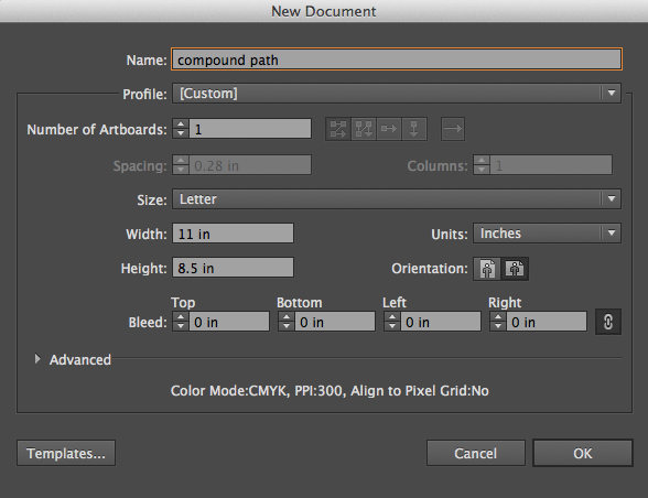
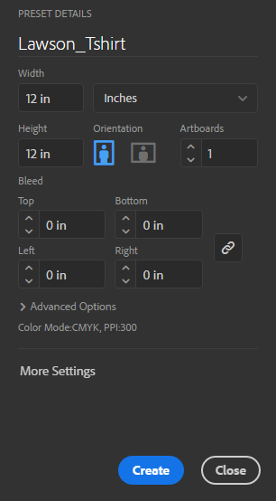
  2. Open Adobe Illustrator and create a new file. File -> New. Set up the dimensions as follows:
    new_file
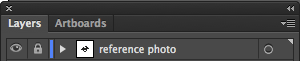
  3. Place the image in Illustrator. File -> Place.
  4. Double-click the layer to and rename it “reference photo.”
    Click the box next to the eye to lock the layer (a lock icon should appear).
    layers_1
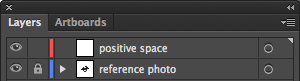
  5. Click the new layer button. new_layer Double-click on the new layer and name it “positive space.”
    layers_2
  6. Select the pen tool. pen_tool
  7. In the colors palette at the bottom left of the screen, remove the outline by clicking the outline icon to bring it forward, then clicking the square with the red line through it.
    no_stroke
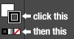
  8. Double-click on the fill icon (the solid square) to change the fill color to something you like.
  9. Use the pen tool to outline the shape. Open the transparency window. (Window -> Transparency)
  10. Select the black arrow from the tool bar on the left side of the screen. black_arrow
    Then click anywhere on the screen away from the shape you have just traced to deselect it.
    pathed_positive_space
  11. Pick a different fill color.
  12. Make a new layer. Name it “negative space”.
  13. Select the pen tool and trace over the negative space shapes.
  14. Select the black arrow from the tool bar on the left side of the screen.
    Click on one shape at a time and make sure the opacity of each shape it set to 100%.
    pathed_negative_space
  15. Select all of the shapes by holding down on the shift key as you click each one.
    At the top of the screen, Object -> Compound Path -> Make.
  16. Your “negative space” shapes should now be completely transparent.
    transparent_rabbit
  17. Your “positive space” layer is now empty.
    Click on it and then click on the trash can icon to delete it.
    layers_3
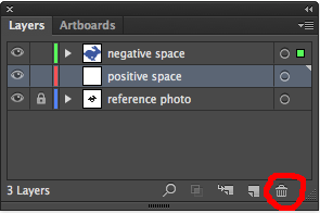
  18. Double-click on the “negative space” layer and rename it “rabbit”.
    layers_4

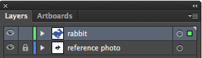
How to add a background:

  1. Make a new layer above your reference photo layer and below your positive space layer.
    Name it “background.”
    layers_5
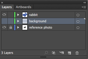
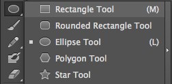
  2. Click the rectangle tool in the tool bar on the left side of the screen.
    rectangle_tool
  3. Change the fill color to be your desired background color.
  4. Click and drag to draw a box that covers the entire background area.
    blue_bg
  5. Save your file as a PDF (File -> Save as -> Select “Adobe PDF” as the file format)
    save_as_pdf
  6. Save your file as a PNG. (File -> Save for Web and Devices -> PNG-24)
  7. Create a new blog post and upload both the PDF and PNG.

Part 2: Finish tracing over the 4 shapes we started last class

Post both a PDF and PNG of your completed assignment to your blog

Part 3: Creating a multicolor vector image:

  1. Download one of the images pictured below (Right-click on the image of your choice -> Save Image As -> Save to your desktop)jordansvector-catvector_cookies
  2. Create a new file in Adobe Illustrator and place the downloaded photo in that file. (File -> place) (DO NOT try to open your downloaded image in Illustrator! This will cause strange things to happen.)
  3. Create a new layer by clicking on the “new layer” button at the bottom of the layers palette on the right side of the screen. new_layer_button
  4. Trace over your first shape. (You may need to decrease the opacity of this layer so you can see what you are tracing. You can do this by clicking on the transparency icon transparency_icon on the right side of the screen and decreasing the opacity so it is below 100. transparency_window)
  5. Bring the opacity back 100% and adjust the color if necessary.
  6. Repeat steps 3 and 4 until you are happy with your vector illustration.
  7. Save your file as BOTH a .pdf and .png
  8. Create a new blog post with BOTH a .pdf and .png of your work

Today we will:

  • Complete the compound path/adding a background tutorial, save our file as both a PDF and PNG and post both files to our blog
  • Finish and post the vector shapes tutorial to our blog (you must complete all 4 shapes and post both a PDF and PNG)
  • If you have time: trace over one of the multicolor images from the blog post and post the competed PDF and PNG to your blog.

Welcome to the Media Component of Foundations 2!

n-CAT-COMPUTER-628x314

Today’s essential question: What do I need to do to be successful in the Media component of Foundations 2?

Today we will look at some of the projects we will create this year, set up our Foundations2 folders in Google Drive, learn how to use the Pen Tool in Adobe Illustrator, and publish our first blog post. By the end of this class you should:

  • Discuss tracking sheets, grading policy, and view examples of the projects we will create in this class
  • Create a Media2 folder in your school Google Drive account and share it with Ms. Lawson (2013045@rcsd121.org)
  • Complete the Vector Practice Assignment
  • Publish your first blog post

Part1: Overview of Foundations 2 Media Projects

Here are some examples of the types of projects we will create in this class.
Which projects are you most excited by?

Part2: Creating a Shared Media Folder in Google Drive

  1. Log into your school Gmail account. (Username: student # @rcsd121.org; Password: same password you use to log into the school computers.)
  2. Click on the squares in the top right corner of the screen and select Drive
    google_drive
  3. Click on “New” on the top left side of the screen and then “Folder” from the drop down menu to create a new folder
    new_folder
  4. Name your folder “LastName_FirstInitial_Foundations2”
    new_folder_name
  5. Right click on the folder and select “Share.”
    share_folder
  6. Share the folder with me and make sure you give me permission to add items.
    folder_permissions

Need help? Please follow the following process:

  1. Check the blog
  2. Ask two classmates
  3. Still stuck? Raise your hand and Ms. Lawson will help you as soon as she is available.

Part 3: Vector Art & The Pen Tool in Adobe Illustrator

Today’s essential question: How can I use the pen tool to create vector imagery in Adobe Illustrator?

Remember how scaling a raster image larger will pixelate the image (as in the example below)?
pixelated_escher_screen_shot

Today we will learn about a different type of image called a vector. Vector images can be scaled infinitely and will never get blurry. Logos are usually vector images so they can be printed on everything from buttons to billboards without becoming blurry.

Here are some examples of vector art:

air-jordan-logo-brand-1000x500   OVO OWL1-B-LOGO-JPG


Vector Practice Tutorial

Today we will view a demo at the Smart Board and then follow these steps to learn how to use the pen tool in Adobe Illustrator:

Part 1: Setting Up the File
  1. Right-click to save the image below:
    vector_practice
  2. Open Adobe Illustrator.
  3. Select “New Print Document” from the pop up screen.
  4. Create a new file in Adobe Illustrator with the following guidelines:
    1_file_setup
  5. Place the image you just downloaded from this blog post. (File -> place)
    DO NOT try to open your downloaded image in Illustrator! This will cause strange things to happen.
Part 2: Using the Pen Tool to Draw Straight Lines
  1. Create a new layer by clicking on the “new layer” button at the bottom of the layers palette on the right side of the screen. new_layer_button
  2. Select the pen tool. pen_tool
  3. You can change the color by clicking on the square at the bottom of the toolbar on the left hand side of the screen: 2_color_change
  4. Trace over your first shape (the star). Click once to add the first anchor point. Move your mouse to the next position and click again to create the second point. The two anchor points will be connected together.3_star1
  5. Continue clicking points around the star IN ORDER until you reach the starting point.
    4_star2
    5_star3
    (You may need to decrease the opacity of the star you are drawing so you can see what you are tracing. You can do this by clicking on the transparency icon on the right side of the screen and decreasing the opacity so it is below 100. transparency_window)
    6_star4
  6. Close the path by clicking on the starting point a second time. Bring the opacity back 100% and adjust the color if necessary.
    7_star5
Part 3: Using the Pen Tool to Draw Curves
  1. Click to create your first point.
  2. Click where you would like your next point to be, but do not let go of the mouse until you have dragged the point to adjust the curve:
    heart1
  3. Click on the middle dot. This should make the second half of the tangent line, or handle, disappear:
    heart2
  4. Click where you would like your next point to be, but do not let go of the mouse until you have dragged the point to adjust the curve:
    heart3
  5. Once again, click on the middle dot. This should make the second half of the tangent line, or handle, disappear:
    heart4
  6. Continue adding points around the heart in order. Close the path by clicking on the starting point a second time.
    heart5
  7. Follow the same steps to outline the apple.
  8. Follow the same steps to outline the dog.
Part 4: Saving your file and posting to the blog
  1. Save your file as a .pdf (File -> Save As -> PDF)
  2. Save your file as a .png (File -> Save for Web & Devices -> PNG-24)
  3. Create a new blog post with both a PDF and PNG of your work

Today we will:

  • Discuss tracking sheets, grading policy, and view examples of the projects we will create in this class
  • Create a Media2 folder in your school Google Drive account and share it with Ms. Lawson (2013045@rcsd121.org)
  • Complete the pen tool mini lesson in Adobe Illustrator
  • Save our file as a PDF
  • Create a new blog post with the following:
    • the PDF file of our completed mini lesson
    • a PNG of our completed mini lesson
    • a few sentences describing any challenges you faced, how you worked through them, and how you feel about the pen tool