Setting Up our Propaganda Posters in Illustrator

Today’s essential question: How can I set up my poster file in Adobe Illustrator?

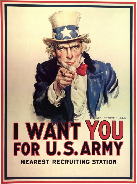
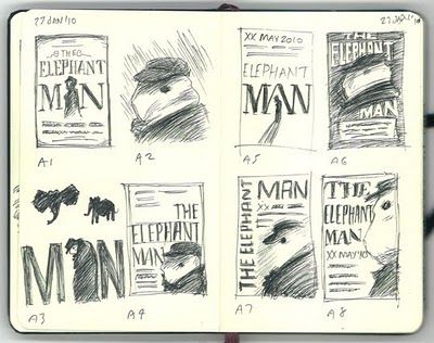
If you have not already done so, you must sketch your layout for your poster design, color it with marker, photograph it, and publish it to your blog.

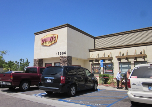
Today we will begin creating our propaganda posters in Adobe Illustrator. Make a folder (Right-click on the desktop, New-> Folder) drag your reference photo into this folder, and save your Illustrator document to this folder. You must keep your Illustrator file and your reference photo in the same folder, or the photo will disappear the next time you open the Illustrator document and you will have nothing to trace! Make sure you are uploading this folder daily to your school Google Drive to back up your work.

Setting Up our Propaganda Posters in Illustrator

Part 1: Crop the image to the correct dimensions in Photoshop

  1. Open the image in Photoshop
  2. Select the crop tool crop_tool
  3. At the top of the screen, set the dimensions to 12×18″ (or 18×12″ if you want a landscape poster)
    crop_dimensions
  4. Drag the edges of the crop tool to select just the poster
  5. Hit the “Enter” key
  6. Save your image as a new jpg (File -> Save as -> Newfilename.jpg)

Part 2: Create the propaganda poster Illustrator file

  1. Open Adobe Illustrator
  2. Create a new file. File -> New.
    Set the dimensions as follows (flip the height and the width if you want a landscape orientation):
    file_settings
  3. Place your reference photo. File -> Place. It may not fit the dimensions of the paper exactly.
    That is ok. You can scale the image to fit by holding down the shift key and scaling from the corner. Make sure you do this or you will distort your proportions! Also, pay attention to the box with the black border – the black border defines the edges of your paper, and anything that extends beyond the border will be cut off.
  4. In the layers palette, double-click to rename Layer 1 “Reference.”
    Then click the space to the left of the layer to lock it:
    layers_reference
  5. Now press the new layer button new_layer to make a new layer, and name it whatever you plan on tracing over (ex. Hair, hair highlights, etc)
    You may also want to create and name a new layer for each image you plan to vectorize. You can group sub-layers within layers, and close and expand these layers like folders to organize your file.
    layers_folders
    Start naming and organizing your layers right away, or your project will become a mess with hundreds of layers. If you can’t figure out what layer you are on, the teacher will not be able to help you, either!
  6. Use the eyedropper tool eyedropper to select and match a color from your reference photo.
    Use the pen tool pen_tool to trace create vector illustrations.
  7. Use the rectangle tool rectangle_tool to create boxes. (To color your background, you will draw a box over the entire page.)
  8. At the end of class, save your file as a PDF (File -> Save as -> PDF) and upload the PDF to your blog.
    save_as_pdf
  9. Also save your file as a PNG (File -> Save for Web & Devices) and post this in the same blog post as your PDF
  10. Upload the folder with your work to your Google Drive.

Today we will:

  • Crop our reference photo of our sketch in Photoshop
  • Create a new 12×18 or 18×12 file in Adobe Illustrator
  • Place ourreference photo of our sketch in this file
  • Begin vectorizing our layout sketch
  • Save our file as a PDF and PNG
  • Create a new blog post with the following:
    • a jpg of our reference photo sketch cropped to the correct dimensions
    • the PDF of our progress
    • a PNG of our progress
  • Upload the folder with our work to our school Google Drive

Integrating Text & Image

Today’s essential question: How can I integrate the text into the design on the poster?

Joniah has done a great job incorporating interesting lettering into her poster design.
Notice how much more boring her poster would be if she had just written the words on the paper instead of creating custom lettering and working it into the picture:


Here are some other examples of posters that have successful integrated type and image:


For ideas on how to create interesting text, search dafont.com for interesting typefaces.
Click on the typeface you want to preview, type in the words you plan to use on your poster, and hit submit.
You can then use the snipping tool to take a screen shot of each heading written in that typeface:
blog_post_every_Day.png
You can use these screen shots as references when sketching your poster design.

Today we will:

  • Finish our sketches (colored in with marker) of our vector poster project design
  • Photograph our sketch
  • Create a new blog post with the following:
    • a photograph of our vector poster project design
    • a few sentences describing the concept

Featured Artist: Shepard Fairey

Today’s essential question: How has Shepard Fairey used simple vector graphics to create powerful propaganda posters?

Featured Artist: Shepard Fairey

shepard_400x400from artsy.net

“Expanding on the legacies of artists such as Keith Haring and Andy Warhol, Shepard Fairey’s practice disrupts the distinction between fine and commercial art. A major artist of the street art movement, Fairey rose to prominence in the early 1990s through the dispersion of posters, stickers, and murals, related to his Obey Giant campaign, which yielded an international cultural phenomenon. Fairey’s iconic poster of President Barack Obama was adopted as the official emblem associated with the presidential campaign and encapsulates a number of recurring concerns in the artist’s work, including propaganda, portraiture, and political power.”

You can learn more about Shepard Fairey on his official website.

Examples of Shepard Fairey’s work

Things to think about:

  • Abstraction vs. realism
  • How will you establish a clear focal point?
  • Flat design vs. shading
  • Mood
  • Color Scheme

Creating a Final Sketch to Vectorize

Today you will sketch your final layout larger, with all details and text on a piece of 6×9″ paper. (The small size will force you to create a design that is simple enough to trace over in Illustrator.) Everything should look exactly as you want it, as you will be photographing this piece and tracing over it in Illustrator.

Here is an example of an acceptable final sketch that is ready to be vectorized in Illustrator:

Today we will:

  • Discuss the work of Shepard Fairey
  • Begin sketching our final design on properly proportioned paper
  • Post a photo of our work to our blogs (you must post a photo even if you have not finished your sketch!)

Next Project: Propaganda Posters

Essential Question: What makes an effective propaganda poster?

Learning Objectives (What you will learn by doing this project):

  • I can use visual hierarchy and the rule of thirds to create an interesting composition with a prominent focal point
  • I can create art as a means of communication and persuasion

For our next project, we will create a propaganda poster. We will begin by examining posters from World War II, but will spend most of our time looking at modern day propaganda posters. These posters should look familiar. What are some techniques the artists have used to persuade the viewer?

wecandoit

Unclesamwantyou-520x700


Project Requirements:

Part I: 3 Thumbnail sketches

You will show Ms. Lawson all three, and she will help you pick the strongest one to turn into a full-size poster.
Here are some examples of acceptable thumbnail sketches:

elephant_man_thumbnail_sketch

Part II: Final Sketch

You will sketch your final layout larger, with all details and text on a piece of 6×9″ paper. (The small size will force you to create a design that is simple enough to trace over in Illustrator.) Everything should look exactly as you want it, as you will be photographing this piece and tracing over it in Illustrator.

Here is an example of an acceptable final sketch that is ready to be vectorized in Illustrator:

Part III: Final Vector Poster
  • 12×18″
  • Created in Adobe Illustrator
  • Effectively communicates an idea
  • Clear focal point created through visual hierarchy and the rule of thirds
  • Displays understanding of the principals of design (contrast, repetition, alignment, proximity)
  • Contains a text tagline (ie. “Hope,” “Make Art Not War,” “We Can Do It!”)
    Text adds to the design and does not feel like an afterthought
  • High-quality craftsmanship
  • Here are some examples of acceptable vector posters:

Possible Topics (feel free to come up with your own as well):

  • cyberbullying
  • influence of social media
  • depression & suicide
  • sexual harrassment & assault
  • racism & microaggression
  • educational inequality/segregation
  • unequal distribution of wealth
  • LGBT issues
  • DACA (deferred action for childhood arrivals)
  • police brutality
  • gun control
  • government spending (defense spending vs education & healthcare)

Today we will:

  • Brainstorm potential project concepts
  • Create 3 different thumbnail sketches for your chosen concept
  • Create a new blog post with the following:
    • a photo of your thumbnail sketches
    • a few sentences describing the concept for your propaganda poster

Featured Artist: Annie Liebovitz

Today’s essential question: How do professional photographers use a green screen to tell a story?

Today we will finish our Photoshop Multiple Mes project. We will upload our final projects to our Google Drives, and create a final blog post with both a PNG of our final project and an artist statement that is a minimum of 150 words.

Featured Artist: Annie Liebovitz

Photographer Annie Liebovitz creates fantasy scenes with a combination of elaborate costumes, props, lighting, and digital manipulation.This article shows how Annie Liebovitz created her Disney series. Here are some examples of her work:

Here are some behind-the-scenes photos illustrating how she created these images:

Today we will finish our Multiple Mes project. We will  upload our final Photoshop (.psd) and PNG files to our Google Drive Folders. We will then make a blog post with a PNG of our final image and an artist statement (minimum of 150 words and written in paragraph form) about our project.

Today we will:

  • Finish our Multiple Mes Photoshop Collage
  • upload both the Photoshop (.psd) and PNG files of our final projects to our Google Drive Folders
  • Create a new blog post with the following:
    • A PNG of our finished project
    • A 150 word artist statement about our project.
      Not sure what to write? Start by answering the following questions:

      • Describe your artwork
        • What does your artwork look like?
        • What is the subject matter?
        • What art elements or principles are most obvious in your work?
      • How did you create your art?
        • What media is your artwork made from?
        • Describe the process or steps you took to create your artwork.
      • What is the big idea behind your artwork?
        • Who or what inspired your artwork?
        • What is your artwork about?
        • How do you want people to feel when they view your artwork?
      • Overall thoughts
        • What did you learn from creating this artwork?
        • Is the final piece what you imagined? How so?
        • What did you do well? What could you have done better?

Matching Lighting with Filters, Dodge, and Burn

Today’s essential question: How can I use filters and the dodge and burn tools to match the lighting throughout my Photoshop collage?

By this point, you should have started combining your images in Photoshop to create a scene. The lighting likely differs throughout, making it obvious that the scene was created from several different images. Today we will learn how to create the illusion of cohesive lighting through filters and the dodge and burn tools.

Adjusting Color with Photo Filters

For an image to look cohesive, the lighting needs to be consistent throughout. The image below was clearly Photoshopped because Mckenzie is not as blue as the background:
blue_woods_no_filter

We can change that by using Photo filters.

  1. First, select the layer with Mckenzie on it in the layers palette on the bottom right hand side of the screen. At the top of the screen, go to Image -> Adjustments -> Photo Filter
    image_adjustments_photo_filter
  2. We can then select different photo filters from the drop down menu, and preview them to see which one is the best fit. Similarly, we can also preview the intensity of the filter by adjusting the slider. For this particular image, the Cyan filter at 40% seems to create the most realistic effect:
    cyan_filter
    blue_woods_filter

Now let’s see if we can create a similarly realistic effect with a warmer background. Once again, notice how the original photo looks awkward when first placed in the scene:
orange_fire_no_filters

  1. Once again, we will select the layer with Mckenzie on it in the layers palette on the bottom right hand side of the screen. At the top of the screen, go to Image -> Adjustments -> Photo Filter. This time, the Warming Filter (85) at 60% seems to create the most realistic effect:
    warming_filter
    orange_fire_filters

Establishing a Clear Light Source with the Dodge and Burn Tools

Photo filters match the colors of each piece of the photo collage, but for a truly unified image, we will need to establish a clear light source. This is where the dodge and burn tools come in. They will allow us to add highlights (dodge tool) and shadows (burn tool) in a similar manner to traditional drawing.

In the image with Mckenzie, the fire is a natural light source. Therefore, we will want to darken the left side of Mckenzie, the bottom portion of Mckenzie, the ground area around Mckenzie and the fire, and the bottom portion of the logs.

  1. First, we will select the burn tool burn_tool from the tool bar on the left side of the screen.
  2. Next we will adjust the settings at the top of the screen. It works best if you set the exposure of the burn tool low, and darken your desired area slowly. This is how I have set my burn tool:
    burn_tool_settings
  3. Now select your desired layer in the layers palette on the lower right side of the screen. I always duplicate the layer (Layer -> duplicate layer) before dodging or burning it, so I can go back to the original layer if I mess up.
  4. Paint your desired area with the burn tool. You can adjust the size of the brush at the top of the screen, or by using the right and left brackets. Slowly shade the areas you want to darken just as you would with a pencil. You will have to select each layer in the layers palette on the lower right side of the screen before you can use the burn tool on any objects in that layer. Notice how we have now created a clear light source by painting shadows with the burn tool:
    orange_fire_filters_burn_tool
  5. If you would like to highlight any parts of the image, click and hold on the burn tool in the tool bar on the left side of the screen. The dodge tool dodge_tool should appear in a drop down menu below it. Select the dodge tool, adjust the setting at the top of the screen so the exposure is set to 15-25%, and paint as needed to create highlights.

Here is a side by side comparison of the original collage, as well as the collage after we have applied photo filters and the burn tool:

Be careful not to go overboard with the dodge and burn tools:
intense_burn_tool

Today we will:

  • Continue building our scenes in Photoshop
  • Upload today’s Photoshop file to your Google Drive account
  • Create cohesive lighting using photo filters, dodge, and burn
  • Create a new blog post with the following:
    • A PNG of your progress so far
    • A few sentences describing any challenges you faced today, how you worked through those challenges, and what you would like help with

Concept Refinement

Today’s essential question: What is my project concept? How will I create it in Photoshop?

download.jpegPlease view the progress report  I have placed in your folder. I  think many of you will be surprised by how low your grades are due to missing blog posts. Additionally, very few people properly completed the blog post assignment proposing their concepts. These are the only people who have received full credit and may continue to work on their projects: Joniah, Viviam, Rae’iona, Sylena, John.

Everyone else must create a proper project proposal blog post before doing any more work on their projects.

You must submit ONE concept blog post with the following items:

  • Sketch (including the background/scene).
  • Paragraph describing your concept. Include the following:
    • Describe your concept
    • What will you photograph for your 3-6 green screen images?
    • What background or scene will you use?
    • What extra images or accessories will you add?
    • What costumes or props will you need to bring in next class for the green screen photography portion?
  • Any images you may use from the internet (background should be larger than 12MP, other images should be larger than 2MP)

Viviam and Sylena’s posts and exactly what I am looking for.

Today we will:

  • Publish a blog post with a complete project proposal (this is your last chance to receive credit for this assignment)
  • Resume working on our Multiple Mes project, upload the most recent files to our Google Drive, and post today’s progress to our blog

Combining images to build a unique setting

Today’s essential question: How can I combine images to build a unique setting for my story?

Today we will continue building our scene in Photoshop. remove backgrounds from images we will use in our digital collage. If you have removed the background from your green screen photos, you can begin dragging your clones into your scene. Otherwise, you will download pieces of your scene from Google images and remove the backgrounds from the various pieces that will comprise your setting. Remember to use layers to make your scene look realistic.

Creating a setting

You must photoshop at least 3 different images together for your background or setting.  (So, for example, you cannot just put the images you photographed in front of the green screen into an existing photograph – you must add at least 2, preferably more, other items to customize your scene.) The emptier the scene you start with, the better. For example, the image below is terrible for the purposes of the project, because it is already full of cars and people, so we have no room to add our own:
1f2d7a02-dd5c-45e9-84fe-b98e76377bf1

The next image is much better, because it has space to add whatever cars or people we would like, giving us complete control over the mood we establish:
dennys_restaurant_at_the_elko_junction_shopping_center_in_elko_nevada_cropped

Here is another example. These wooded scenes are all a great place to start because they have ample space in the foreground to add other imagery:

Here are some extra images that might make the scene more interesting:

Today we will:

  • Finish removing backgrounds from images we will use in our digital collage (make sure you save each image as both a Photoshop and PNG file and upload them to your Google Drive!)
  • Begin dragging your clone photos and other accessories into your background scene
  • Upload all your work (both Photoshop and PNG files) to your Foundations 2 folder in your Google Drive
  • Create a new blog post with the following:
    • Before and after photos of any images where you removed the background
    • A PNG of your combined scene so far
    • A few sentences describing any challenges you faced today, as well as how you worked through those challenges