Typography Tips & Tricks

Today’s essential question: How can I use typography to create a professional looking cereal box?

Here are some tips on how to combine typefaces to achieve professional results:

Limit yourself to two fonts – one decorative and one plain/legible (easy to read). 

The decorative font should be used for titles and headings, and the plain font should be used for the body/large areas of text.

As a general rule, you should use two different typefaces to keep things interesting yet unified. These typefaces should be fairly different to show contrast. Use the decorative/fun font for titles and headlines, and the more legible plain font for the body/large areas of text.

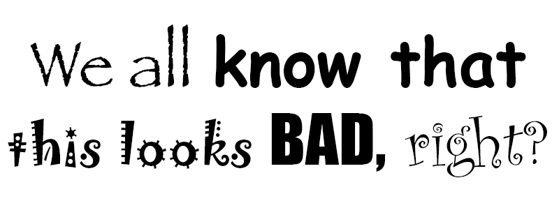
Too many fonts can distract and confuse your audience, like in the example below:

Using too many different “fun” fonts will make your project look like a hot mess

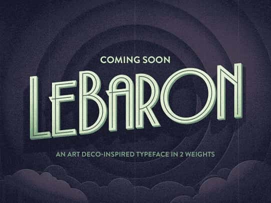
NEVER set body text in a decorative typeface – it will make it illegible and look unprofessional. The image below explains why::
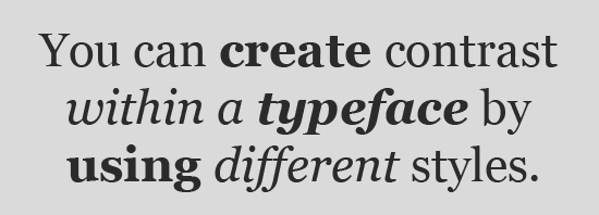
Create Contrast

hipsterTrade-410x215

Using contrasting typefaces makes it clear which text are headings and subheads and which are body copy. The differences help create distinct roles for each font, allowing them to stand out as individual pieces of information. Remember to use the decorative/fun font for titles and headlines, and the more legible plain font for the body/large areas of text.

Avoid combining fonts that are too similar
too_similar2

Conflicts between fonts happen when the fonts look too similar. As you can see in the example above, the two fonts share the same weight, size and decoration. As a result they’ve become too alike. They’re performing very similar roles, but the small differences are conflicting which makes for an awkward overall effect. This makes it difficult to establish a hierarchy, because the fonts aren’t visually distinguishable from each other. In fact, font combinations that are too similar can often times look like a mistake—as if you’d been experimenting with different fonts and had forgotten to clean up after yourself.

Establish visual hierarchy

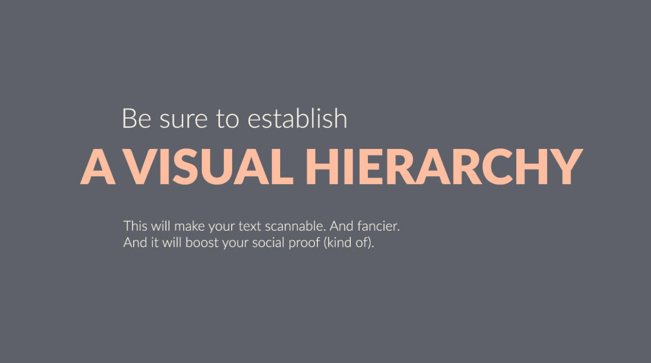
Visual hierarchy tells people where to look first and what is most important. It can be achieved with size, weight, color, texture, orientation and space, or any combination of these tools. Generally, the viewer will first look at whatever is the largest, boldest, or brightest. Visual hierarchy is a great way to add visual interest to your design while limiting yourself to two typefaces.

Use different weights of the same typeface

To pair fonts that come from the same family, plan carefully to create contrast, varying things like font size, weight (such as light, regular, and bold), and case (upper, lower, small caps). One of the benefits of limiting your fonts for a presentation to one font family is that it creates a more consistent look. This is another way to keep your design interesting while limiting yourself to two typefaces.

How to Set Up Your Cereal Box in Photopea

Today’s essential question: How can I set up my cereal box in Photopea?

How to Set Up Your Cereal Box in Photopea

  • Download the cereal box template from Google Classroom
  • Go to Photopea.com
  • Click “Open from Computer” 
  • Open the cereal box template file (it should be in your downloads folder):

How to Change the Background Color

  • Select the “background – color me” layer in the layers palette on the lower right side of the screen
  • Double click on the color swatch  on the lower left side of the screen. Adjust the color until you have selected the color that you would like your background to be.
  • Click and hold on the gradient tool in the toolbar on the left side of the screen until the paint bucket pops up:

    Select the paint bucket. Click anywhere on the cereal box template to paint the background.

How to Add Graphics

  • Go to File -> Open and Place and begin placing your graphics: 
  • Continue using File -> Open and Place to insert your other images
  • Use the move tool   to move images into their correct location

How to Make Objects Smaller or rotate them

  1. Go to Edit-> Free Transform to scale and rotate objects as necessary
    Note: Do not make objects larger. This will cause them to pixelate and become blurry.

How to Duplicate Objects

  1. To duplicate an image, Go to Layer-> Duplicate Layer: 

How to save your images:

  1. Click File -> Save as PSD (This will automatically save your image with layers to your downloads folder)
  2. Upload the PSD to the Google Classroom Assignment

Rule of Thirds

Today’s essential question: How can I use the rule of thirds and visual hierarchy to create a prominent focal point in my cereal box design?

Rule of Thirds

To apply the rule of thirds, break an image down into thirds (both horizontally and vertically) so that you have 9 parts. Place points of interest in the intersections or along the lines to create a more balanced and visually interesting composition. Studies have shown that people’s eyes usually go to one of the intersection points rather than the center of the design. When we use the rule of thirds, we make the way people naturally view images work for us rather than against us.

How have the cereal box designs below used the Rule of Thirds?

How does the sketch below use the rule of thirds?

New Project: Design a Cereal Box

Today’s essential question: How can I use the principles of graphic design to design an attractive cereal box with at least 4 sides that display unity?

For our next project, we will create a 4 paneled cereal box.
Here are some examples that would receive an A:

Project Requirements:

  • Created in Photopea using provided cereal box template
  • The box template must include a solid or gradient fill layer as a background
  • Shows understanding of typography (cereal name is largest and in a fun or decorative typeface, majority of info is in a more legible/boring typeface), chosen typefaces match the style of the graphics and the vibe you are trying to create
  • Design shows an understanding of visual hierarchy (most important items are the largest and contrast with the rest of the design)
  • Design includes the following:
    • Cereal name
    • Slogan or phrase, example “They’re Great!”
    • Free offer: toy or gift
    • Nutrition label (can be real or silly/fake)
    • UPC Bar code
    • Ingredients (can be real or silly/fake)
    • Made with/Good source of “you choose”
    • Net Weight of cereal in box

How to Set Up Your Digital Collage in Photopea

Today’s essential question: How can I set up my digital collage in Photopea?

How to Set Up Your Digital Collage in Photopea

  1. Go to Photopea.com
  2. Click “New Project”
  3. Name the Project so it has your name on it, Select “Instagram,” and hit “Create”:
  4. Go to File -> Open and Place and place the picture of your hero:
  5. Continue using File -> Open and Place to insert your other images
  6. Use the move tool to move images into their correct location

How to Make Objects Smaller or rotate them

  1. Go to Edit-> Free Transform to scale and rotate objects as necessary
    Note: Do not make objects larger. This will cause them to pixelate and become blurry.

How to Duplicate Objects

  1. To duplicate an image, Go to Layer-> Duplicate Layer:

How to save your images:

  1. Click File -> Save as PSD (This will automatically save your image with layers to your downloads folder)
  2. Upload the PSD to the Google Classroom Assignment

How to touch up images in Photopea

Today’s essential question: How can I use Photopea to touch up awkward images that I want to use in my collage?

Several of you have submitted images that are awkwardly cropped, like the example below. Notice how the example next to it will give you more design options when you start creating your collage:

It will even allow you to duplicate and transform your images to create unity and have a high degree of control over the design:

How to adjust awkward images in Photopea

  1. Go to Photopea.com
  2. Open the image (File -> Open)
  3. Click on the eraser tool and erase everything except for one individual flower or leaf.


How to Use the Crop Tool to Remove Excess Space

  1. Click on the crop tool and drag it to select the part of your image that you would like to keep:
  2. Press enter to crop your image:

How to save your images:

  1. Click File -> Save as PSD (This will automatically save your image with layers to your downloads folder)
  2. Upload the PSD to the Google Classroom Assignment

New Project: Hero Collage

Today’s essential question: How can I use Photopea to create a digital collage honoring someone I consider a hero or role model?

Today we will start our next project. We will create a digital collage honoring someone that we consider a role model or hero. It can be a famous person or someone you know in real life. You will brainstorm a list of characteristics that you admire about this person, and then download images of plants that symbolize those characteristics.

Featured Artist: Broobs

Self-Portrait

Broobs Marquez is a digital collage artist. His work is heavily influenced by botanical elements and nature. He strives to meld the past and present through his use of color, shape and subject matter. Marquez exhibits an interest in bringing visibility to queer artists and queer activists and uses his following to educate and illuminate champions of the queer community. Many of his artworks feature individuals who have been marginalized, and in some cases, killed, because of their activism for the LGBT, black, and Latinx communities.

In an interview with Adolescent’s online publication, Broobs talks about why he chooses to work this way:

“It’s really hard work, I’ll be honest. It’s all very emotionally charged. It comes from a place of me wanting to understand why these things even happen—trying to process all these deaths, and trying to understand what death even is. 

In a lot of ways, it’s to combat what I know the media is going to do in the long run, which is vilify them for existing in this world. Whether it be owning a gun, or having traces of marijuana in their system, or some other kind of drug. It’s what they always do with people who suffer police brutality. They always try to vilify them, and try to—in a lot of ways—make it okay that they were killed, by making them out to be quote-unquote ‘bad people.’ 

I feel like that’s what my work does as well. It shines light on them, and almost doesn’t make you question that their life was holy, or valuable. It just makes you see them in that light. “

Project Requirements:

  • Created in Photopea/Photoshop from at least 20 images (at least 5 different images that can be repeated)
  • Includes a photo of someone you consider a hero
  • Includes objects that symbolize characteristics that you admire about this person
  • Objects photos have been altered using filters to create a cohesive style
  • Good craftsmanship – backgrounds have been neatly removed, objects are not pixelated or distorted

Finishing Our Digital Collage Projects

Today’s essential question: What do I need to do to finish my digital collage project in the next few classes?

Here are some examples of projects that are either finished or closet to being finished. What ideas do they give you for your own art?

Representational Collages:

Non-Representational Collages:

Today we will:

  • Continue creating our Everyday Object Digital Collage in Pixlr, Photopea, Procreate, or Photoshop
  • Create a new blog post with the following:
    • an image of our digital collage so far
    • a few sentences describing what your plan is to finish your project

Balancing the Space in Your Design

Today’s essential question: How can I balance the space in my design?

Positive space refers to areas where the subject is positioned.

Negative space is the area surrounding the subject. Don’t think of negative space as blank. In a well-designed composition, negative space is carefully designed to support the positive space in the picture.

There is no rule on how to achieve perfect spacing. In fact, truly even spacing often feels boring or static. This artwork by MC Escher is a good example of balanced spacing that, upon closer inspection, is much less “perfect” than one would initially think:

Here are some in progress examples of student projects that are balancing positive and negative space well. Notice how some have more negative space, and some have more positive space, but they all feel balanced:

Today we will:

  • Continue creating our Everyday Object Digital Collage in Pixlr, Photopea, Procreate, or Photoshop
  • Create a new blog post with the following:
    • an image of our digital collage so far
    • a few sentences describing what went well today, as well as any challenges you faced